"We’re born to be..."
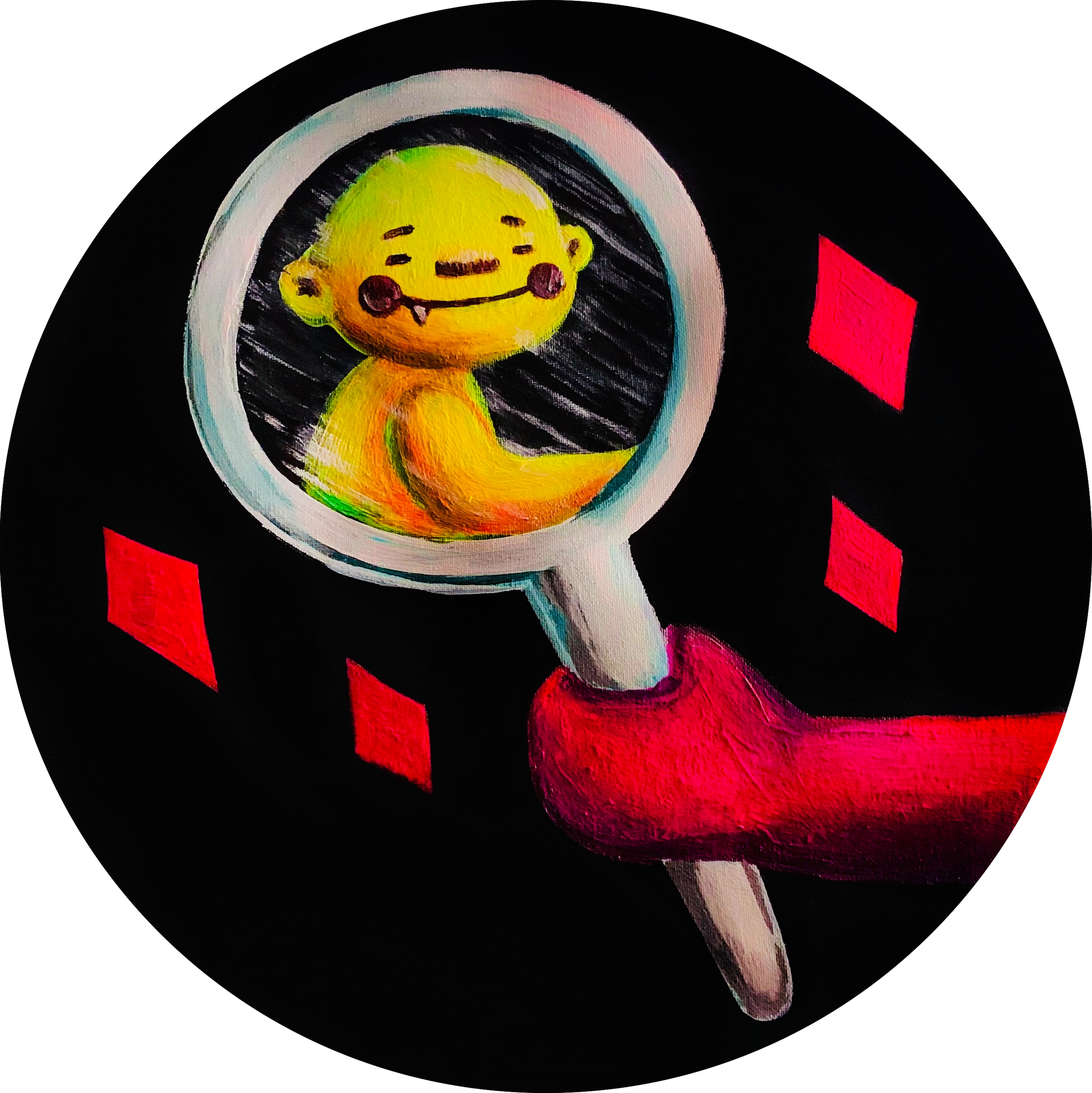
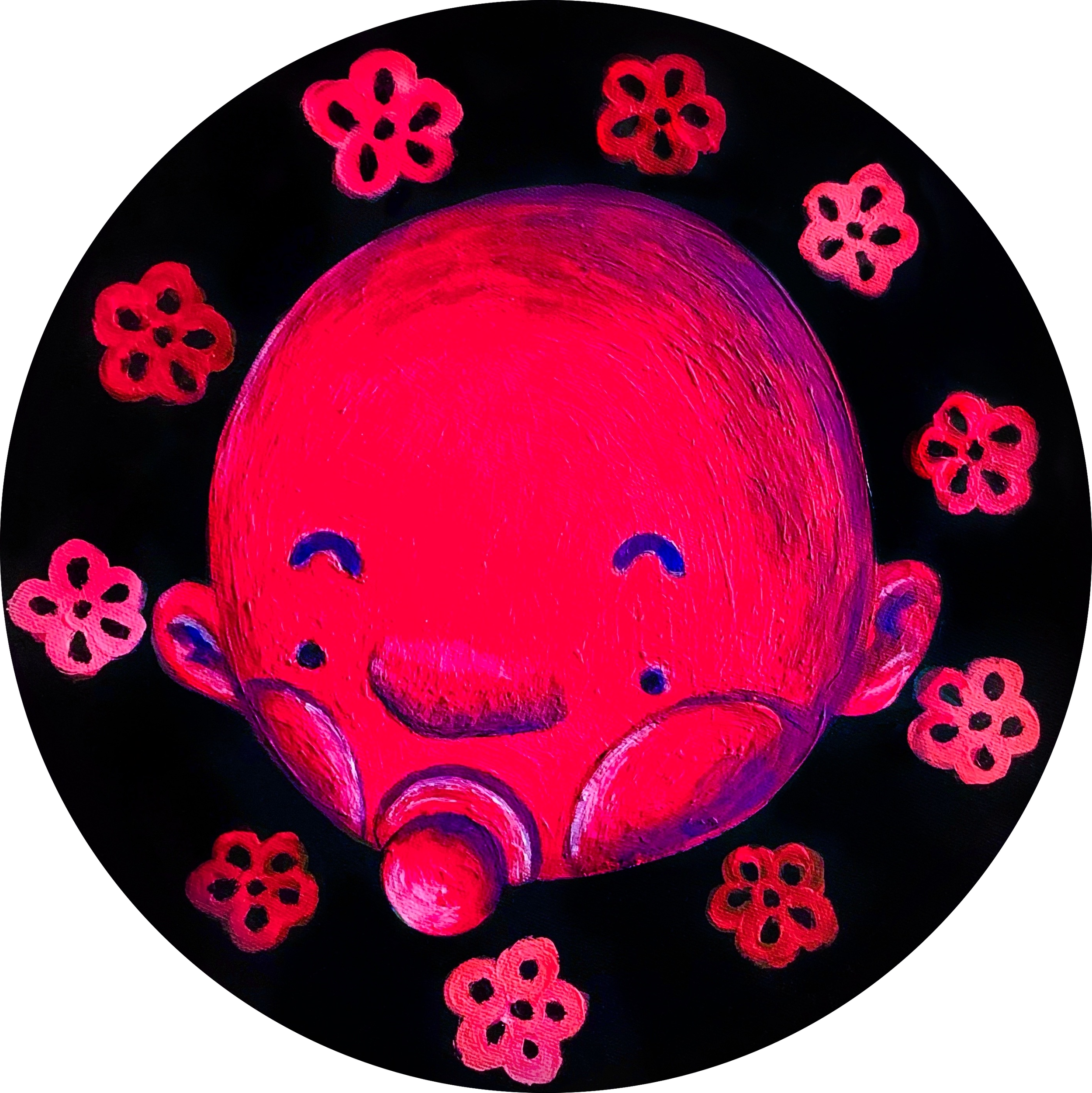
This series is divided into four topics, "Speak Out", "Love & Peace", "Collab", and "Unique" is the core propositions, respectively. In this series of canvases, I chose the circle, because, in the Renaissance period, the circle was regarded as a symbol of perfection. In Christianity, the circle is a perfect shape, because there is no beginning and no end, and there is an eternal meaning. I want to use this idea to extend the attitude I express, which can be infinitely extended and continued. "We’re born to be" is to accept our original appearance and express it for ourselves, not to be influenced by the world, let alone be labeled.
In terms of character development, I prefer to be genderless and race-less, and even these human figures are more inclined to the original appearance of babies, trying to get closer to the axis of "Born".
The reason why the background is created in monochrome black is that I want to focus only on the relationship between the characters, therefore, the best presentation is to simplify the background, and monochrome is the most direct way. Guide the viewer to the correct visual direction and convey the correct information.
*When the work is exhibited in a dark space, it will show a different appearance by illuminating the work with a special light. The presence of fluorescent colors highlights the relationship between the characters in each work.
————————————————————————————————
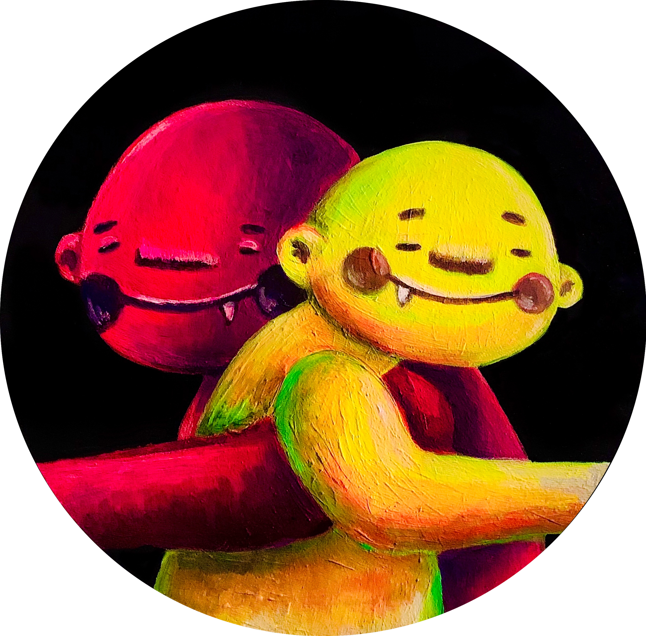
In the three pictures, there are two protagonists with sharp contrast and different skin colors, embracing each other lovingly, extending to the left and right canvases, they hold a mirror to reflect themselves at the same time, and the reflected result is each other, which symbolizes "We are the same", even though we seem to be different races, we're still the same, we're all equal.

"We’re born to be..."
This series is divided into four topics, "Speak Out", "Love & Peace", "Collab", and "Unique" is the core propositions, respectively. In this series of canvases, I chose the circle, because, in the Renaissance period, the circle was regarded as a symbol of perfection. In Christianity, the circle is a perfect shape, because there is no beginning and no end, and there is an eternal meaning. I want to use this idea to extend the attitude I express, which can be infinitely extended and continued. "We’re born to be" is to accept our original appearance and express it for ourselves, not to be influenced by the world, let alone be labeled.
In terms of character development, I prefer to be genderless and race-less, and even these human figures are more inclined to the original appearance of babies, trying to get closer to the axis of "Born".
The reason why the background is created in monochrome black is that I want to focus only on the relationship between the characters, therefore, the best presentation is to simplify the background, and monochrome is the most direct way. Guide the viewer to the correct visual direction and convey the correct information.
*When the work is exhibited in a dark space, it will show a different appearance by illuminating the work with a special light. The presence of fluorescent colors highlights the relationship between the characters in each work.
————————————————————————————————-
In the three pictures, there are two protagonists with sharp contrast and different skin colors, embracing each other lovingly, extending to the left and right canvases, they hold a mirror to reflect themselves at the same time, and the reflected result is each other, which symbolizes "We are the same", even though we seem to be different races, we're still the same, we're all equal.
"We’re born to be..."
This series is divided into four topics, "Speak Out", "Love & Peace", "Collab", and "Unique" is the core propositions, respectively. In this series of canvases, I chose the circle, because, in the Renaissance period, the circle was regarded as a symbol of perfection. In Christianity, the circle is a perfect shape, because there is no beginning and no end, and there is an eternal meaning. I want to use this idea to extend the attitude I express, which can be infinitely extended and continued. "We’re born to be" is to accept our original appearance and express it for ourselves, not to be influenced by the world, let alone be labeled.
In terms of character development, I prefer to be genderless and race-less, and even these human figures are more inclined to the original appearance of babies, trying to get closer to the axis of "Born".
The reason why the background is created in monochrome black is that I want to focus only on the relationship between the characters, therefore, the best presentation is to simplify the background, and monochrome is the most direct way. Guide the viewer to the correct visual direction and convey the correct information.
*When the work is exhibited in a dark space, it will show a different appearance by illuminating the work with a special light. The presence of fluorescent colors highlights the relationship between the characters in each work.
————————————————————————————————-
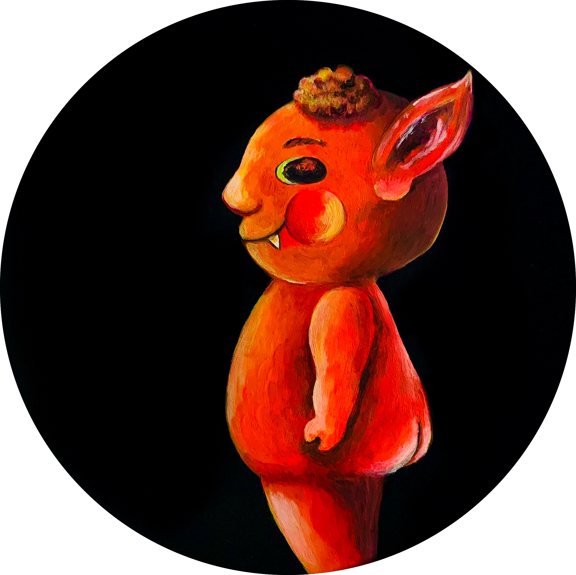
I created and designed three different characters, and each of them has a different personality; from their standpoint, the way they appear on the screen, their looks, and their colors, each one is unique.
"We’re born to be..."
This series is divided into four topics, "Speak Out", "Love & Peace", "Collab", and "Unique" is the core propositions, respectively. In this series of canvases, I chose the circle, because, in the Renaissance period, the circle was regarded as a symbol of perfection. In Christianity, the circle is a perfect shape, because there is no beginning and no end, and there is an eternal meaning. I want to use this idea to extend the attitude I express, which can be infinitely extended and continued. "We’re born to be" is to accept our original appearance and express it for ourselves, not to be influenced by the world, let alone be labeled.
In terms of character development, I prefer to be genderless and race-less, and even these human figures are more inclined to the original appearance of babies, trying to get closer to the axis of "Born".
The reason why the background is created in monochrome black is that I want to focus only on the relationship between the characters, therefore, the best presentation is to simplify the background, and monochrome is the most direct way. Guide the viewer to the correct visual direction and convey the correct information.
*When the work is exhibited in a dark space, it will show a different appearance by illuminating the work with a special light. The presence of fluorescent colors highlights the relationship between the characters in each work.
————————————————————————————————
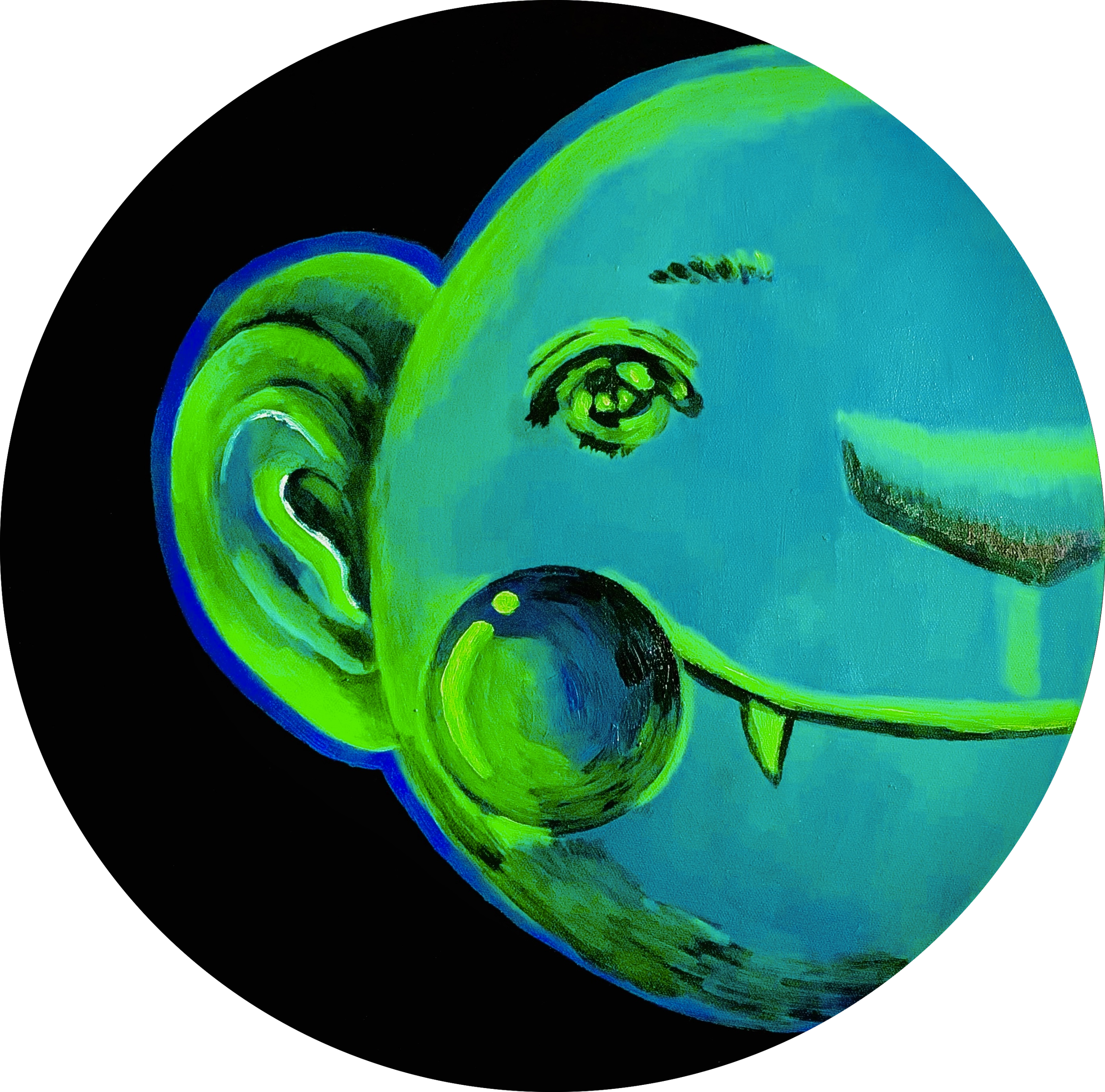
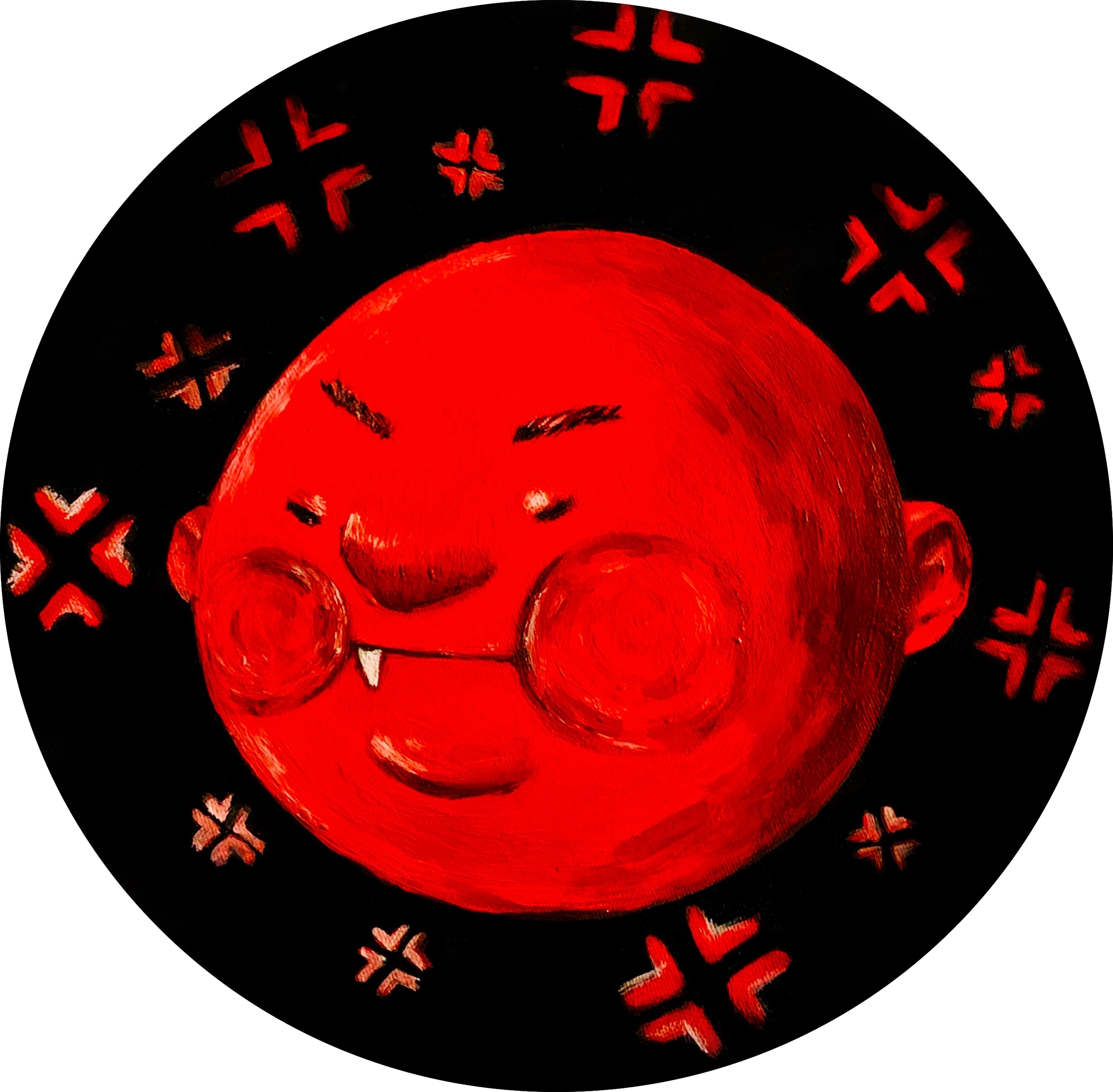
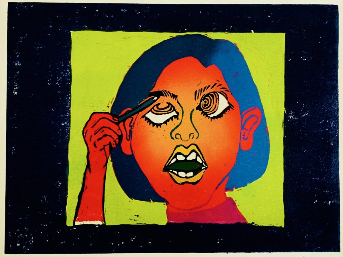
In recent years, the social atmosphere has changed, social platforms have become a part of life, self-awareness has risen, and the courage to speak out for oneself has become a universal value. But it also creates more anxiety and tension in society and is slowly swallowed up by negative energy. When I start to think of ”protesting“ or “speaking out“ can only be linked to negative emotions.
With this work, I want to return to the original intention of speaking, with the four main emotions Delight\ Anger\Sorrow\Happiness, with the original human form baby has not been polluted by the complicated world, to show "Speak Out" with the simplest emotions, Speak out is not only negative, what is interesting is that different emotional types affect the different aspects of "Speak out".
"We’re born to be..."
This series is divided into four topics, "Speak Out", "Love & Peace", "Collab", and "Unique" is the core propositions, respectively. In this series of canvases, I chose the circle, because, in the Renaissance period, the circle was regarded as a symbol of perfection. In Christianity, the circle is a perfect shape, because there is no beginning and no end, and there is an eternal meaning. I want to use this idea to extend the attitude I express, which can be infinitely extended and continued. "We’re born to be" is to accept our original appearance and express it for ourselves, not to be influenced by the world, let alone be labeled.
In terms of character development, I prefer to be genderless and race-less, and even these human figures are more inclined to the original appearance of babies, trying to get closer to the axis of "Born".
The reason why the background is created in monochrome black is that I want to focus only on the relationship between the characters, therefore, the best presentation is to simplify the background, and monochrome is the most direct way. Guide the viewer to the correct visual direction and convey the correct information.
*When the work is exhibited in a dark space, it will show a different appearance by illuminating the work with a special light. The presence of fluorescent colors highlights the relationship between the characters in each work.
————————————————————————————————-
I created and designed three different characters, and each of them has a different personality; from their standpoint, the way they appear on the screen, their looks, and their colors, each one is unique.
"We’re born to be..."
This series is divided into four topics, "Speak Out", "Love & Peace", "Collab", and "Unique" is the core propositions, respectively. In this series of canvases, I chose the circle, because, in the Renaissance period, the circle was regarded as a symbol of perfection. In Christianity, the circle is a perfect shape, because there is no beginning and no end, and there is an eternal meaning. I want to use this idea to extend the attitude I express, which can be infinitely extended and continued. "We’re born to be" is to accept our original appearance and express it for ourselves, not to be influenced by the world, let alone be labeled.
In terms of character development, I prefer to be genderless and race-less, and even these human figures are more inclined to the original appearance of babies, trying to get closer to the axis of "Born".
The reason why the background is created in monochrome black is that I want to focus only on the relationship between the characters, therefore, the best presentation is to simplify the background, and monochrome is the most direct way. Guide the viewer to the correct visual direction and convey the correct information.
*When the work is exhibited in a dark space, it will show a different appearance by illuminating the work with a special light. The presence of fluorescent colors highlights the relationship between the characters in each work.
————————————————————————————————-
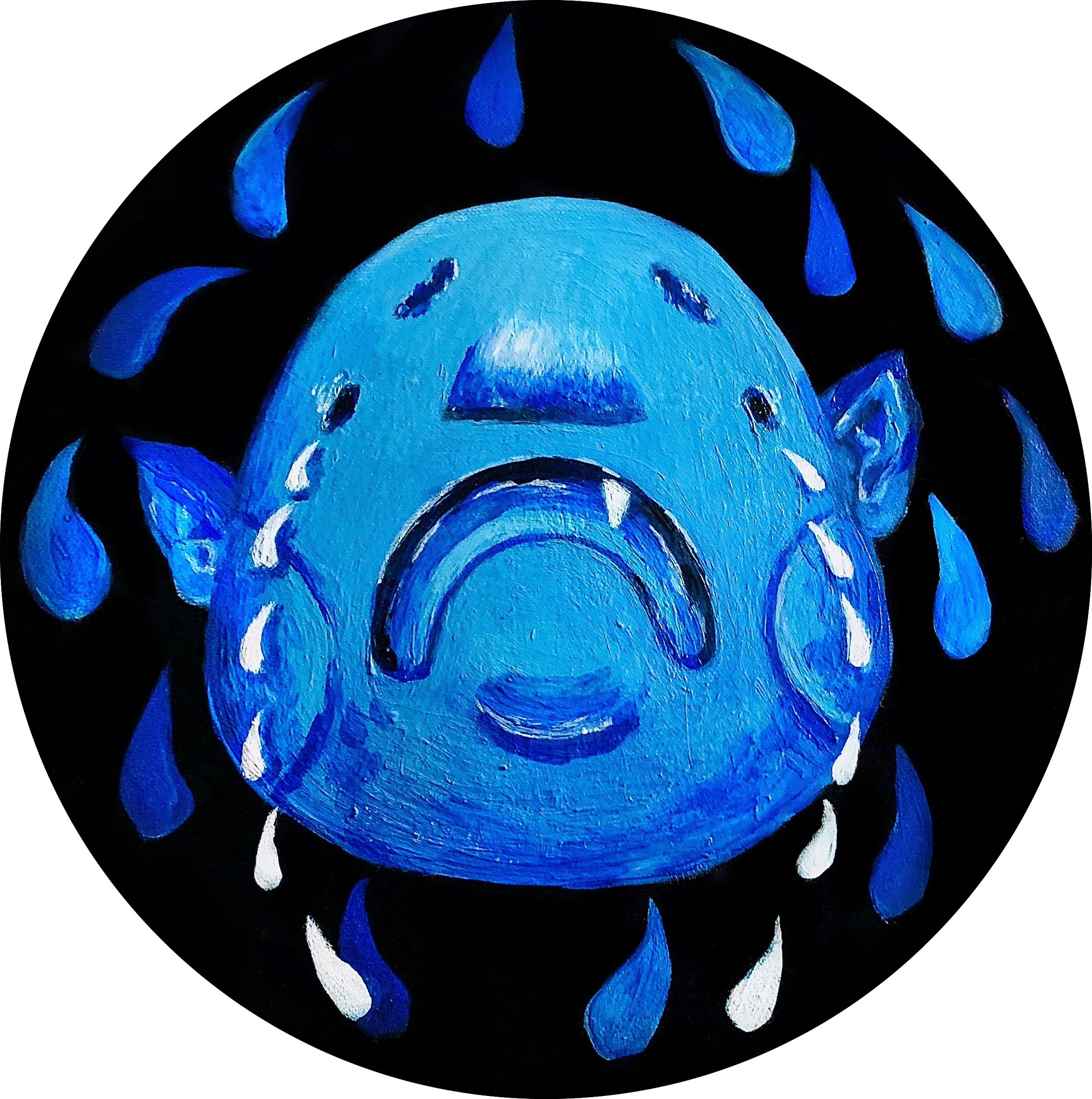
In recent years, the social atmosphere has changed, social platforms have become a part of life, self-awareness has risen, and the courage to speak out for oneself has become a universal value. But it also creates more anxiety and tension in society and is slowly swallowed up by negative energy. When I start to think of ”protesting“ or “speaking out“ can only be linked to negative emotions.
With this work, I want to return to the original intention of speaking, with the four main emotions Delight\ Anger\Sorrow\Happiness, with the original human form baby has not been polluted by the complicated world, to show "Speak Out" with the simplest emotions, Speak out is not only negative, what is interesting is that different emotional types affect the different aspects of "Speak out".
"We’re born to be..."
This series is divided into four topics, "Speak Out", "Love & Peace", "Collab", and "Unique" is the core propositions, respectively. In this series of canvases, I chose the circle, because, in the Renaissance period, the circle was regarded as a symbol of perfection. In Christianity, the circle is a perfect shape, because there is no beginning and no end, and there is an eternal meaning. I want to use this idea to extend the attitude I express, which can be infinitely extended and continued. "We’re born to be" is to accept our original appearance and express it for ourselves, not to be influenced by the world, let alone be labeled.
In terms of character development, I prefer to be genderless and race-less, and even these human figures are more inclined to the original appearance of babies, trying to get closer to the axis of "Born".
The reason why the background is created in monochrome black is that I want to focus only on the relationship between the characters, therefore, the best presentation is to simplify the background, and monochrome is the most direct way. Guide the viewer to the correct visual direction and convey the correct information.
*When the work is exhibited in a dark space, it will show a different appearance by illuminating the work with a special light. The presence of fluorescent colors highlights the relationship between the characters in each work.
_______________________________________________________
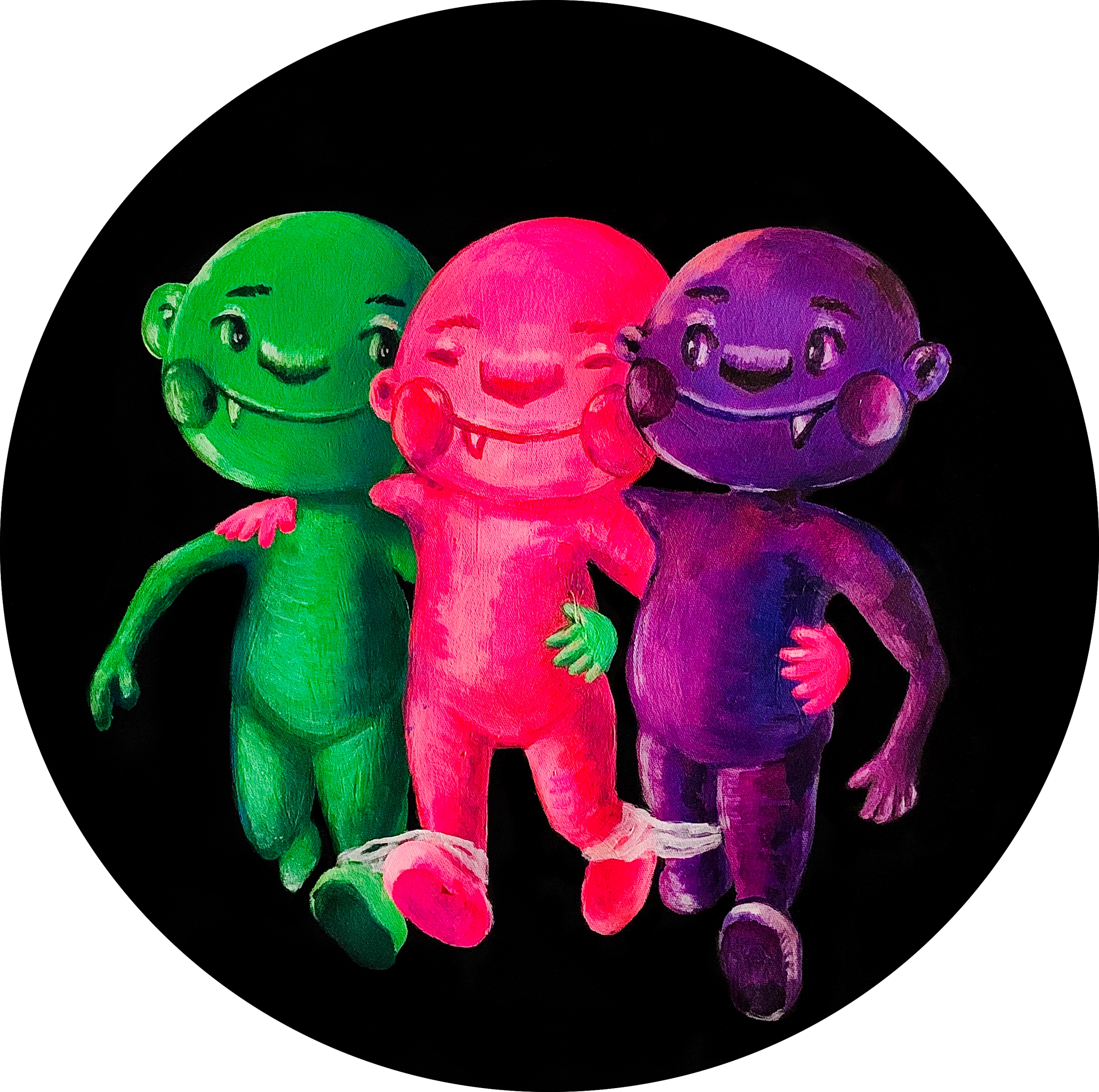
This is an extension of "Love & Peace". It is a metaphor for childhood games: three people and four legs. There are no issues of skin color, race, identity, or gender. The atmosphere in the picture is innocent, peaceful, and loving. Everyone starts from the same starting point. Similarly, to complete this task, each of them lacks a lot of roles, each of which is very important, and it cannot be completed without any one of them. This is a vision that hopes that this complex society can be a little simpler.
"We’re born to be..."
This series is divided into four topics, "Speak Out", "Love & Peace", "Collab", and "Unique" is the core propositions, respectively. In this series of canvases, I chose the circle, because, in the Renaissance period, the circle was regarded as a symbol of perfection. In Christianity, the circle is a perfect shape, because there is no beginning and no end, and there is an eternal meaning. I want to use this idea to extend the attitude I express, which can be infinitely extended and continued. "We’re born to be" is to accept our original appearance and express it for ourselves, not to be influenced by the world, let alone be labeled.
In terms of character development, I prefer to be genderless and race-less, and even these human figures are more inclined to the original appearance of babies, trying to get closer to the axis of "Born".
The reason why the background is created in monochrome black is that I want to focus only on the relationship between the characters, therefore, the best presentation is to simplify the background, and monochrome is the most direct way. Guide the viewer to the correct visual direction and convey the correct information.
*When the work is exhibited in a dark space, it will show a different appearance by illuminating the work with a special light. The presence of fluorescent colors highlights the relationship between the characters in each work.
————————————————————————————————-
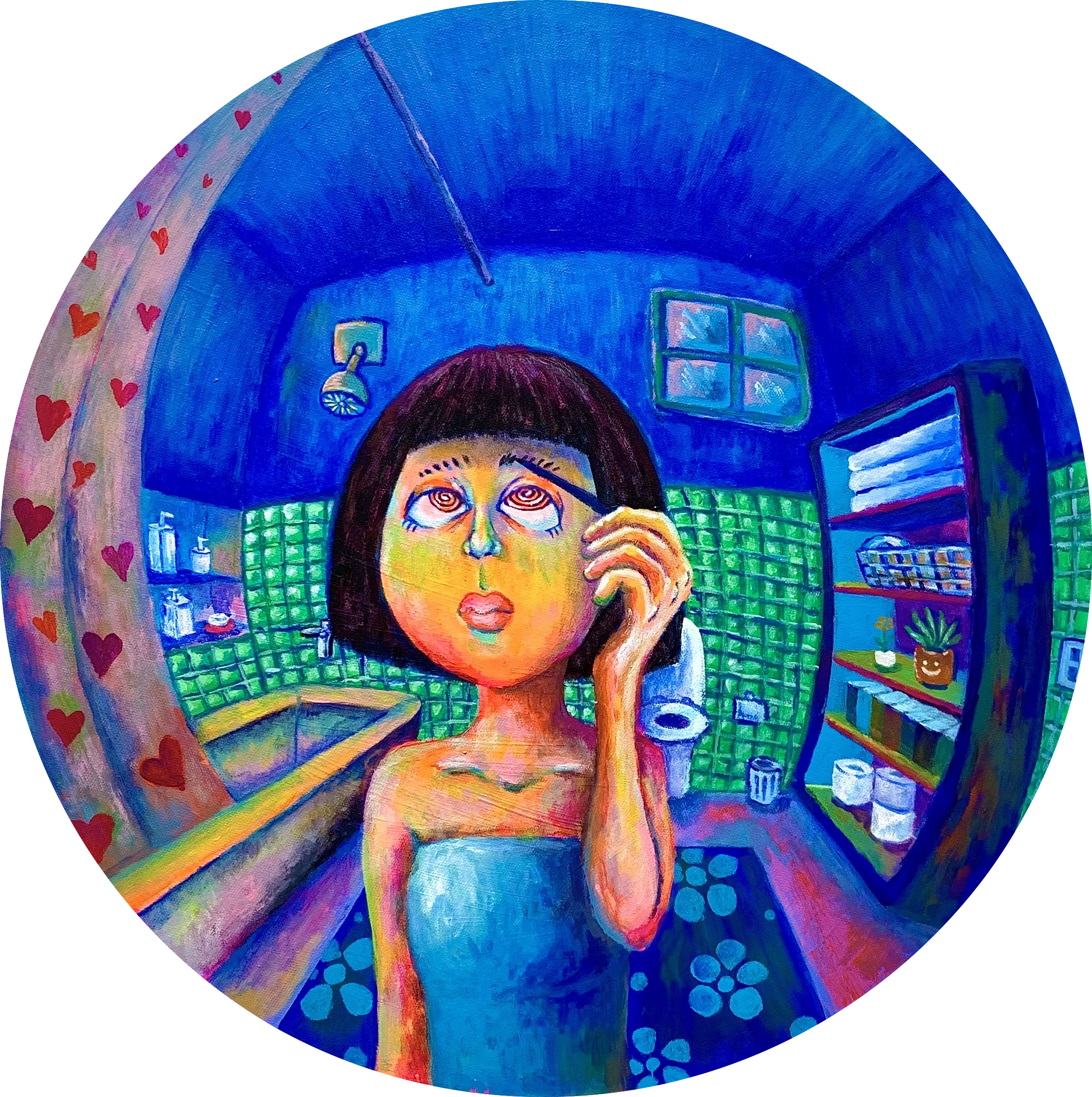
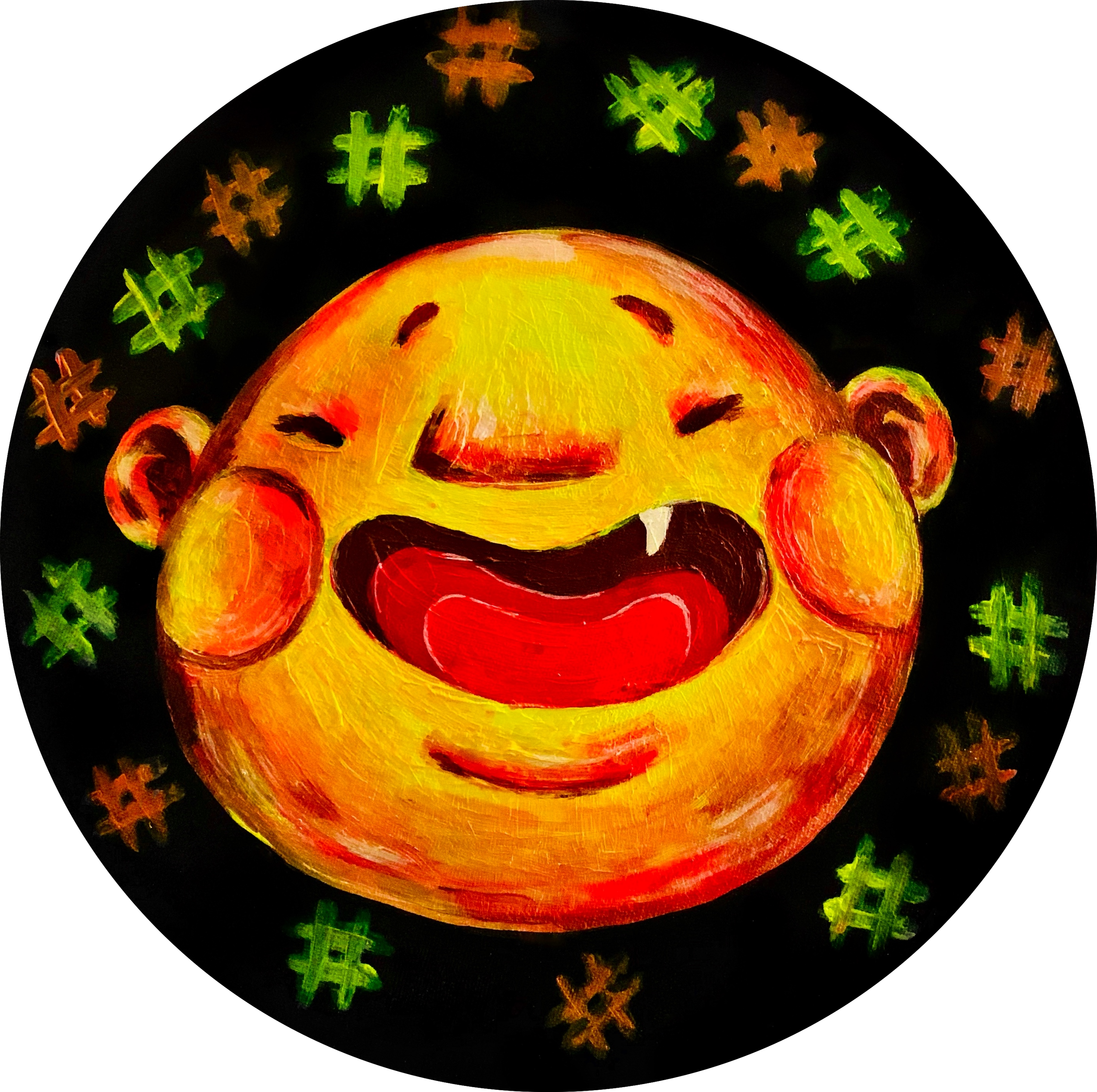
In recent years, the social atmosphere has changed, social platforms have become a part of life, self-awareness has risen, and the courage to speak out for oneself has become a universal value. But it also creates more anxiety and tension in society and is slowly swallowed up by negative energy. When I start to think of ”protesting“ or “speaking out“ can only be linked to negative emotions.
With this work, I want to return to the original intention of speaking, with the four main emotions Delight\ Anger\Sorrow\Happiness, with the original human form baby has not been polluted by the complicated world, to show "Speak Out" with the simplest emotions, Speak out is not only negative, what is interesting is that different emotional types affect the different aspects of "Speak out".
"We’re born to be..."
This series is divided into four topics, "Speak Out", "Love & Peace", "Collab", and "Unique" is the core propositions, respectively. In this series of canvases, I chose the circle, because, in the Renaissance period, the circle was regarded as a symbol of perfection. In Christianity, the circle is a perfect shape, because there is no beginning and no end, and there is an eternal meaning. I want to use this idea to extend the attitude I express, which can be infinitely extended and continued. "We’re born to be" is to accept our original appearance and express it for ourselves, not to be influenced by the world, let alone be labeled.
In terms of character development, I prefer to be genderless and race-less, and even these human figures are more inclined to the original appearance of babies, trying to get closer to the axis of "Born".
The reason why the background is created in monochrome black is that I want to focus only on the relationship between the characters, therefore, the best presentation is to simplify the background, and monochrome is the most direct way. Guide the viewer to the correct visual direction and convey the correct information.
*When the work is exhibited in a dark space, it will show a different appearance by illuminating the work with a special light. The presence of fluorescent colors highlights the relationship between the characters in each work.
————————————————————————————————-In recent years, the social atmosphere has changed, social platforms have become a part of life, self-awareness has risen, and the courage to speak out for oneself has become a universal value. But it also creates more anxiety and tension in society and is slowly swallowed up by negative energy. When I start to think of ”protesting“ or “speaking out“ can only be linked to negative emotions.
With this work, I want to return to the original intention of speaking, with the four main emotions Delight\ Anger\Sorrow\Happiness, with the original human form baby has not been polluted by the complicated world, to show "Speak Out" with the simplest emotions, Speak out is not only negative, what is interesting is that different emotional types affect the different aspects of "Speak out".
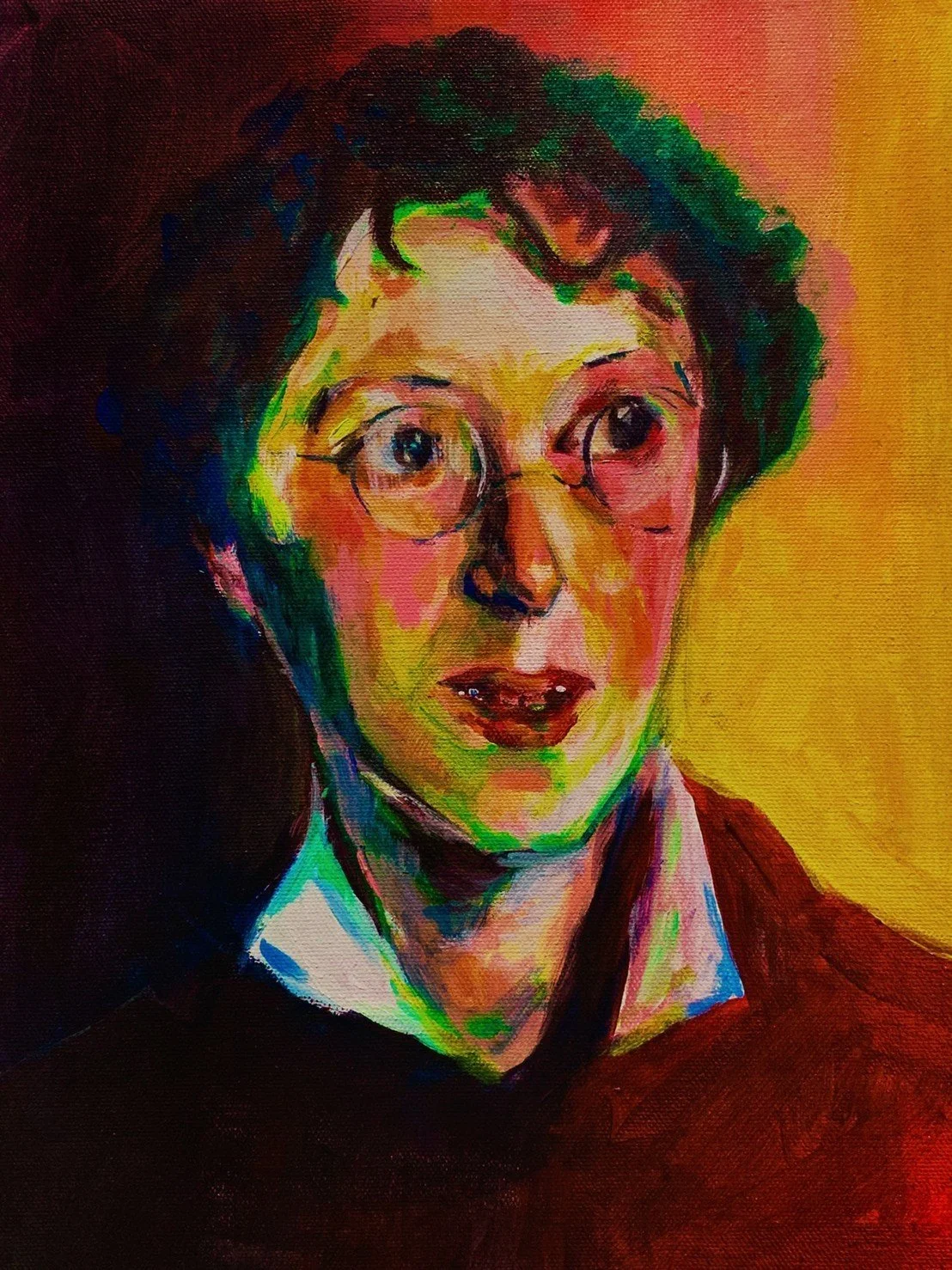
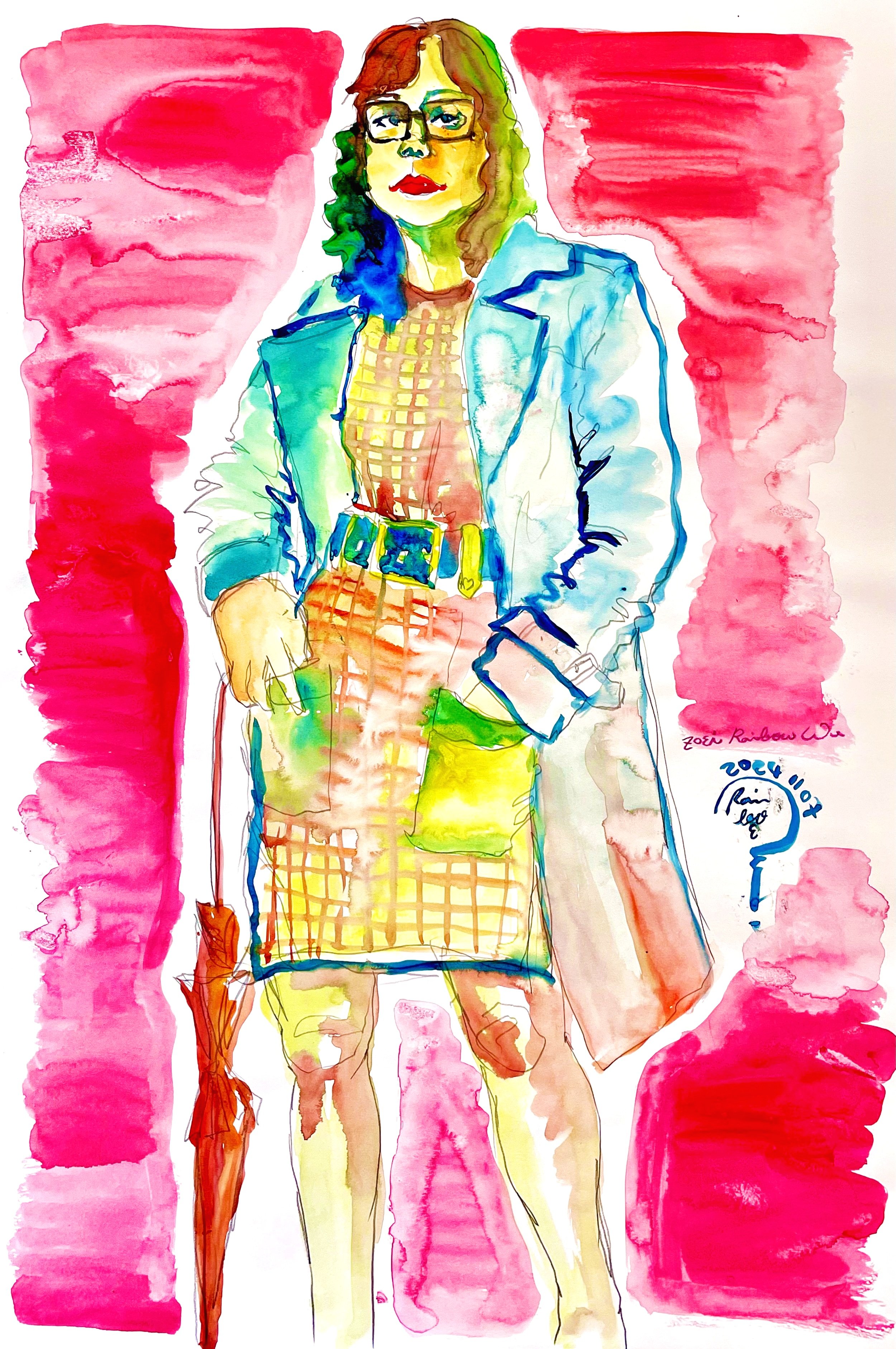
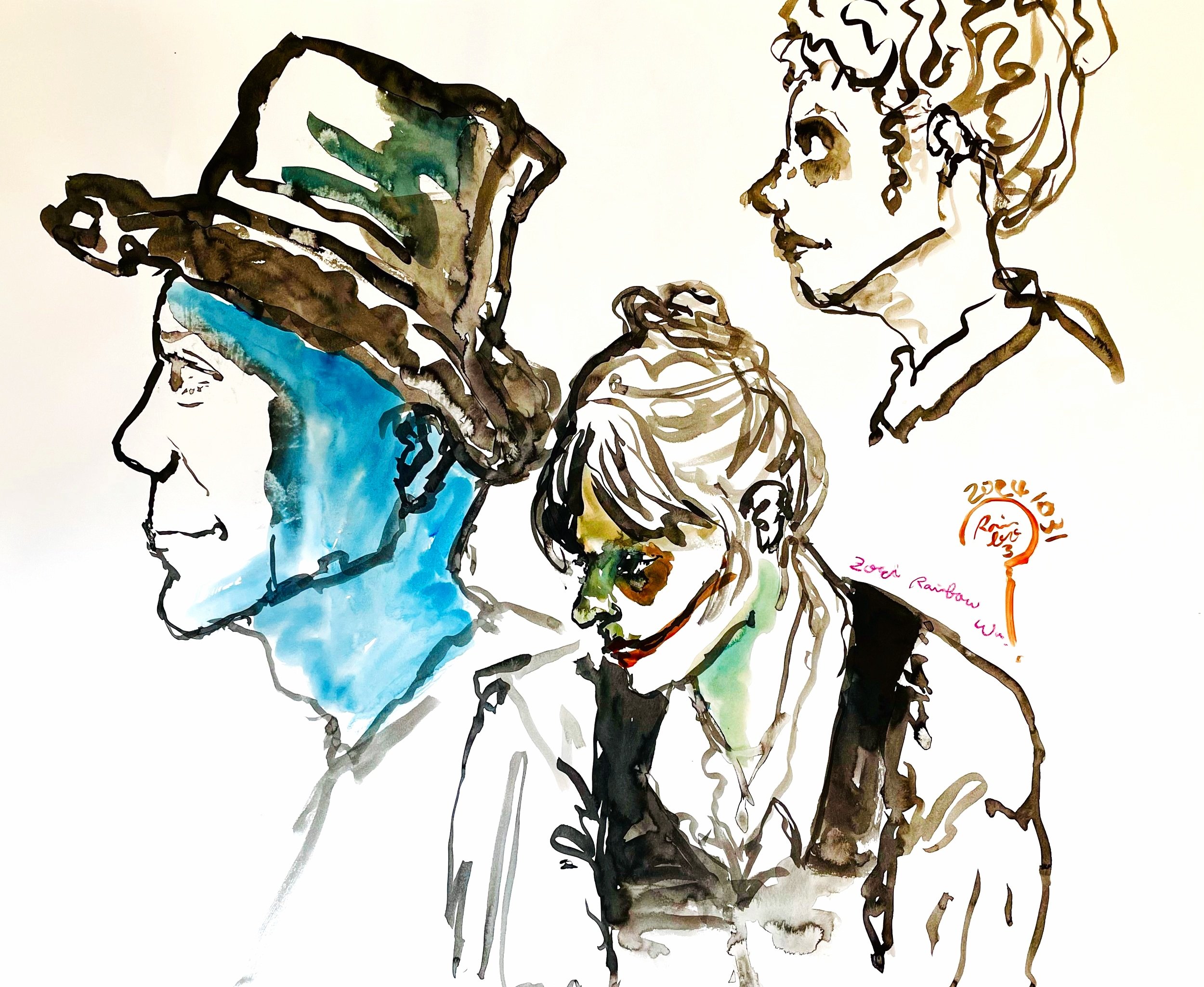
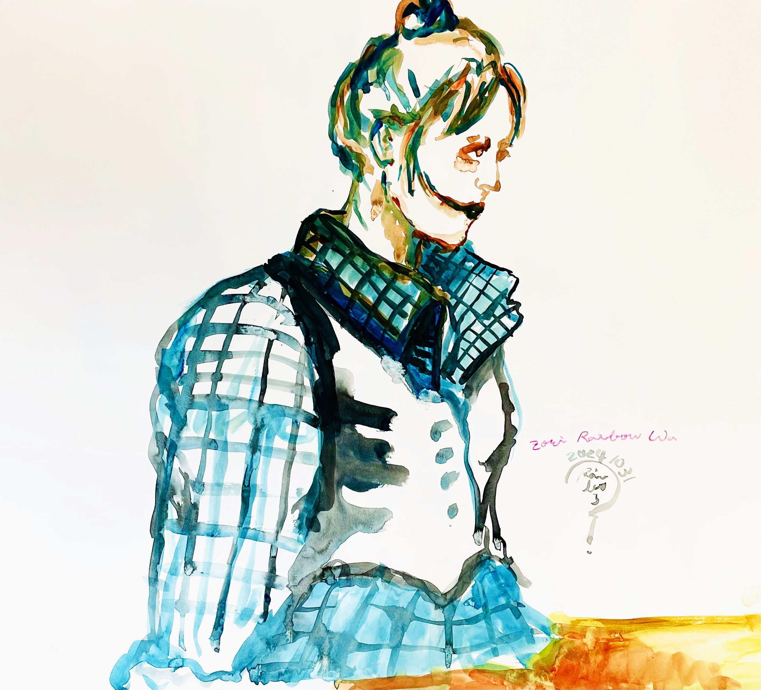
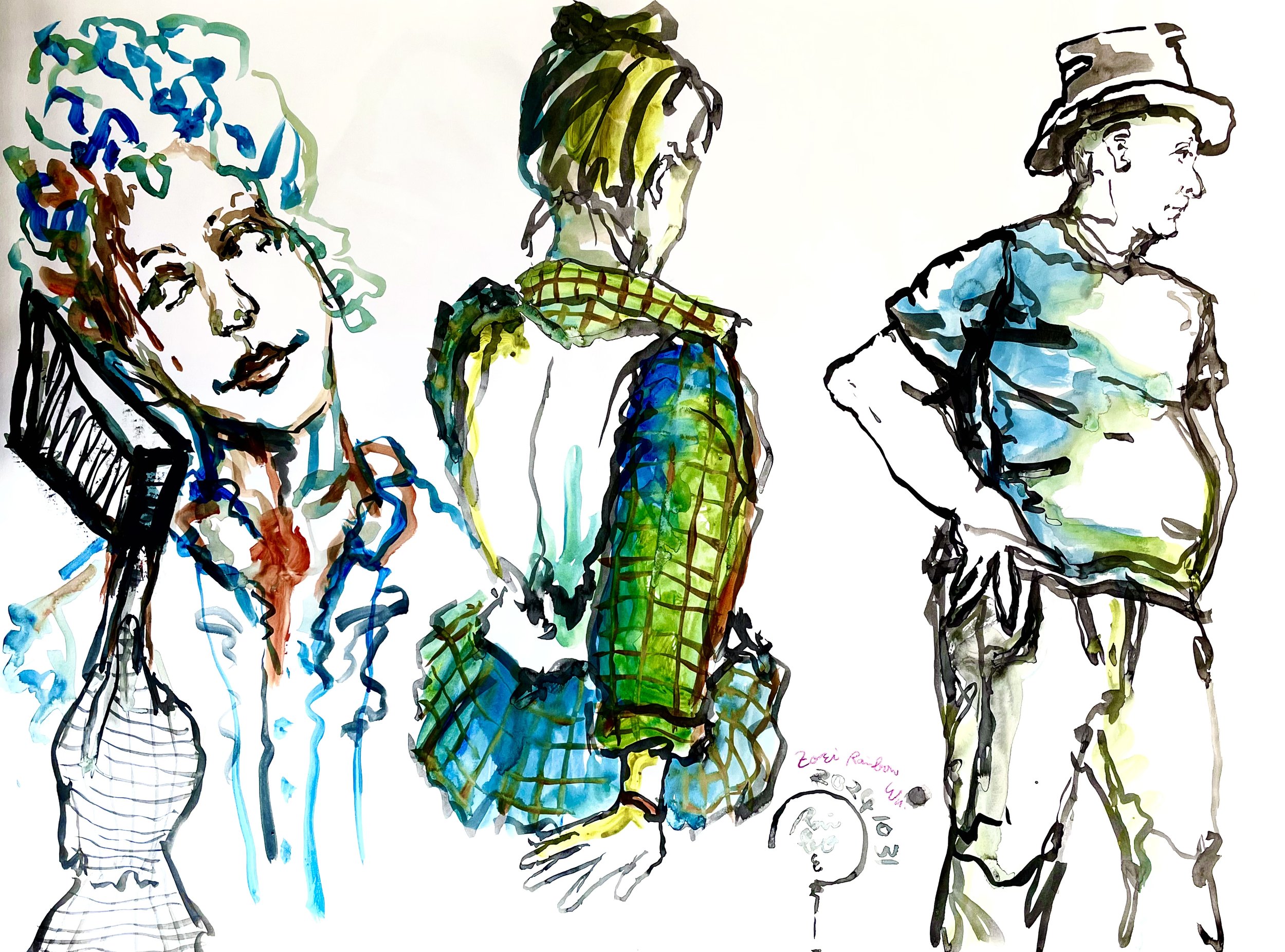
This is the first time I have used acrylic to paint portraits. The use of every color in each piece, from hair to skin color to facial features, represents my personal understanding of the model's appearance and aura. I enjoy the process.
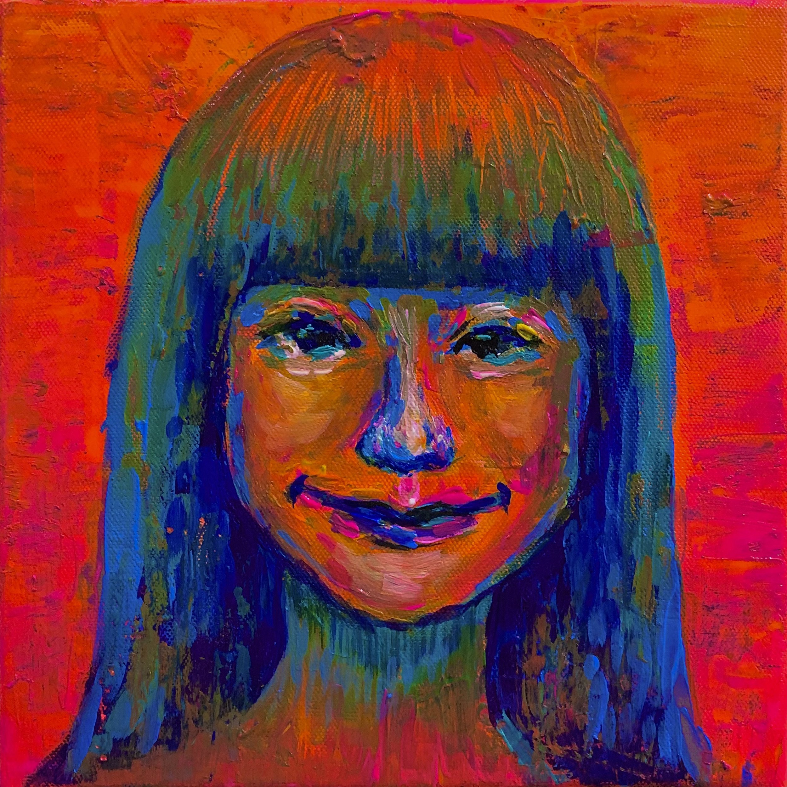
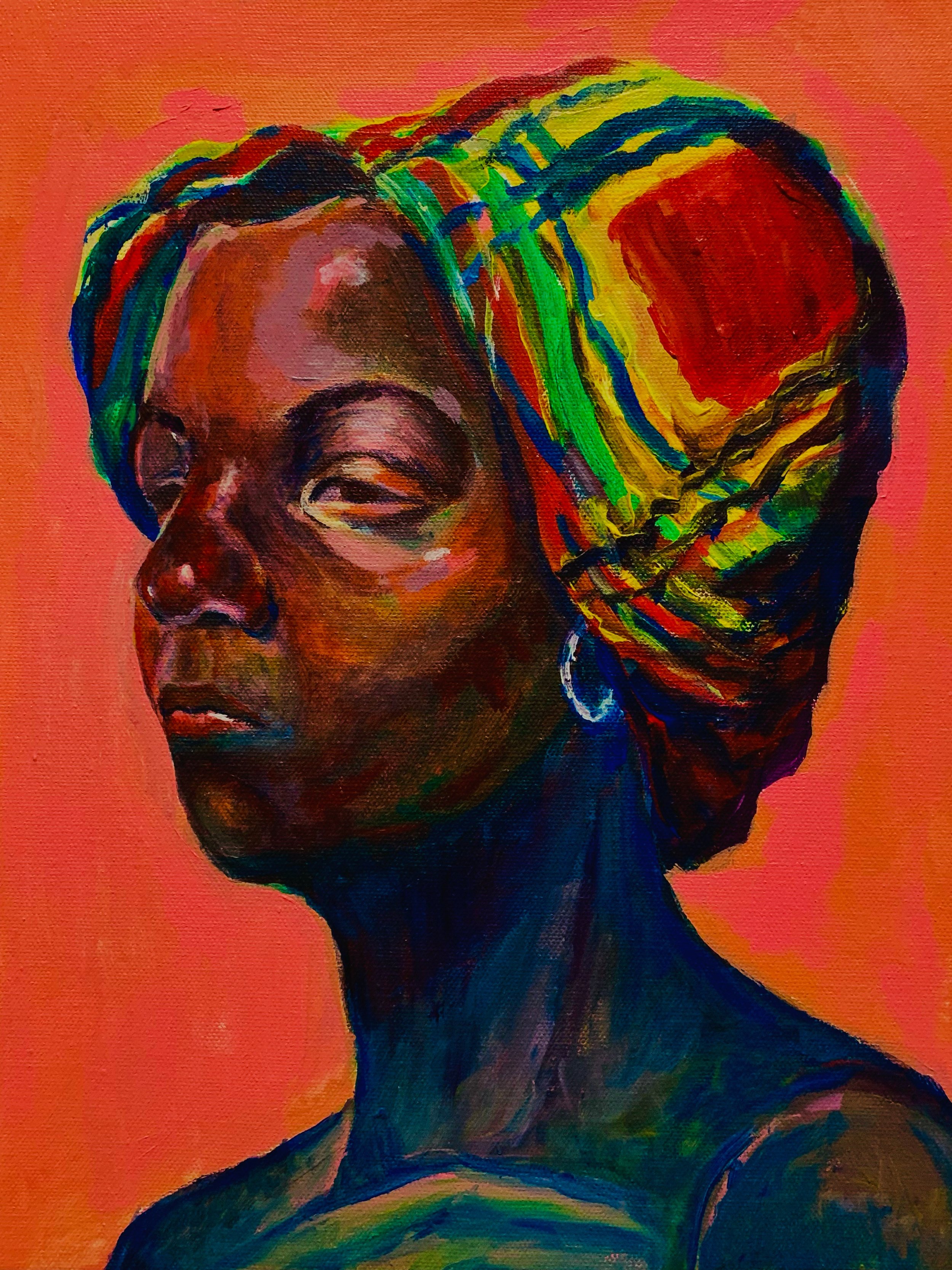
This is the first time I have used acrylic to paint portraits. The use of every color in each piece, from hair to skin color to facial features, represents my personal understanding of the model's appearance and aura. I enjoy the process.
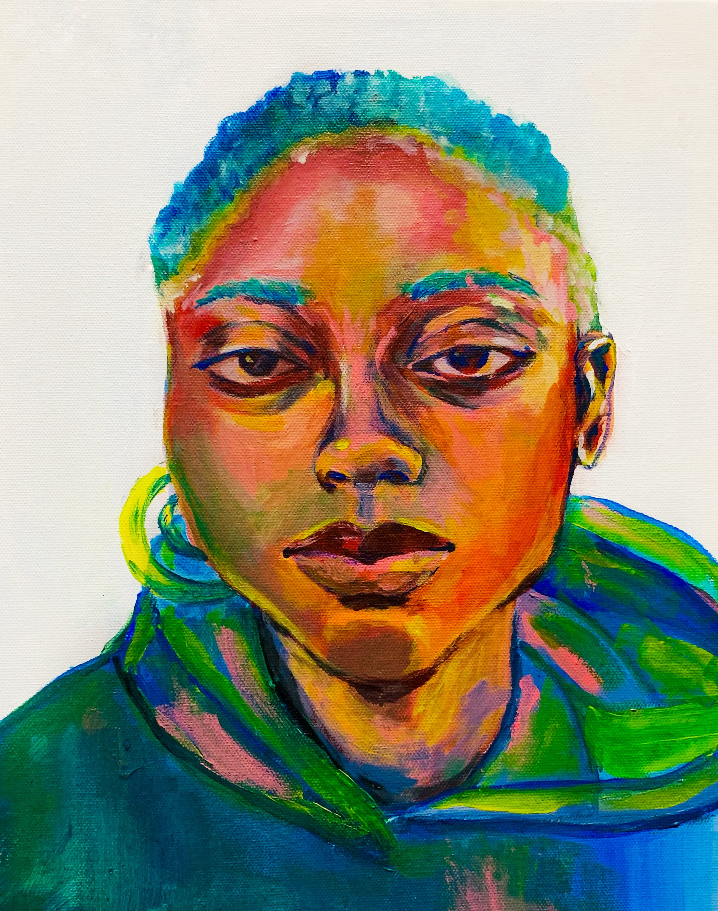
This is the first time I have used acrylic to paint portraits. The use of every color in each piece, from hair to skin color to facial features, represents my personal understanding of the model's appearance and aura. I enjoy the process.
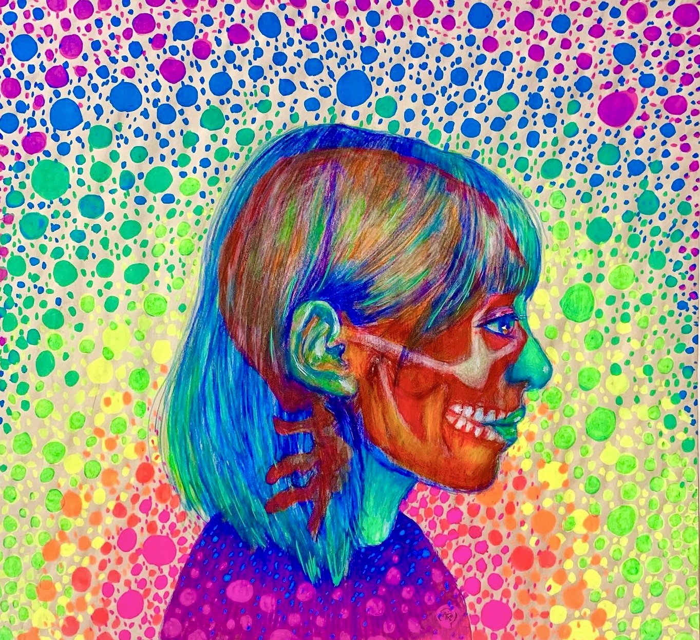
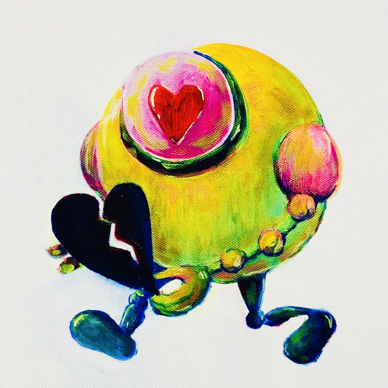
These three works were created during the Covid-19 epidemic. The people and things around me include my own story. I deeply feel that "love" is a very important existence. Even in this severe living environment, love can overcome Everything, love can bring warmth to this cold society.
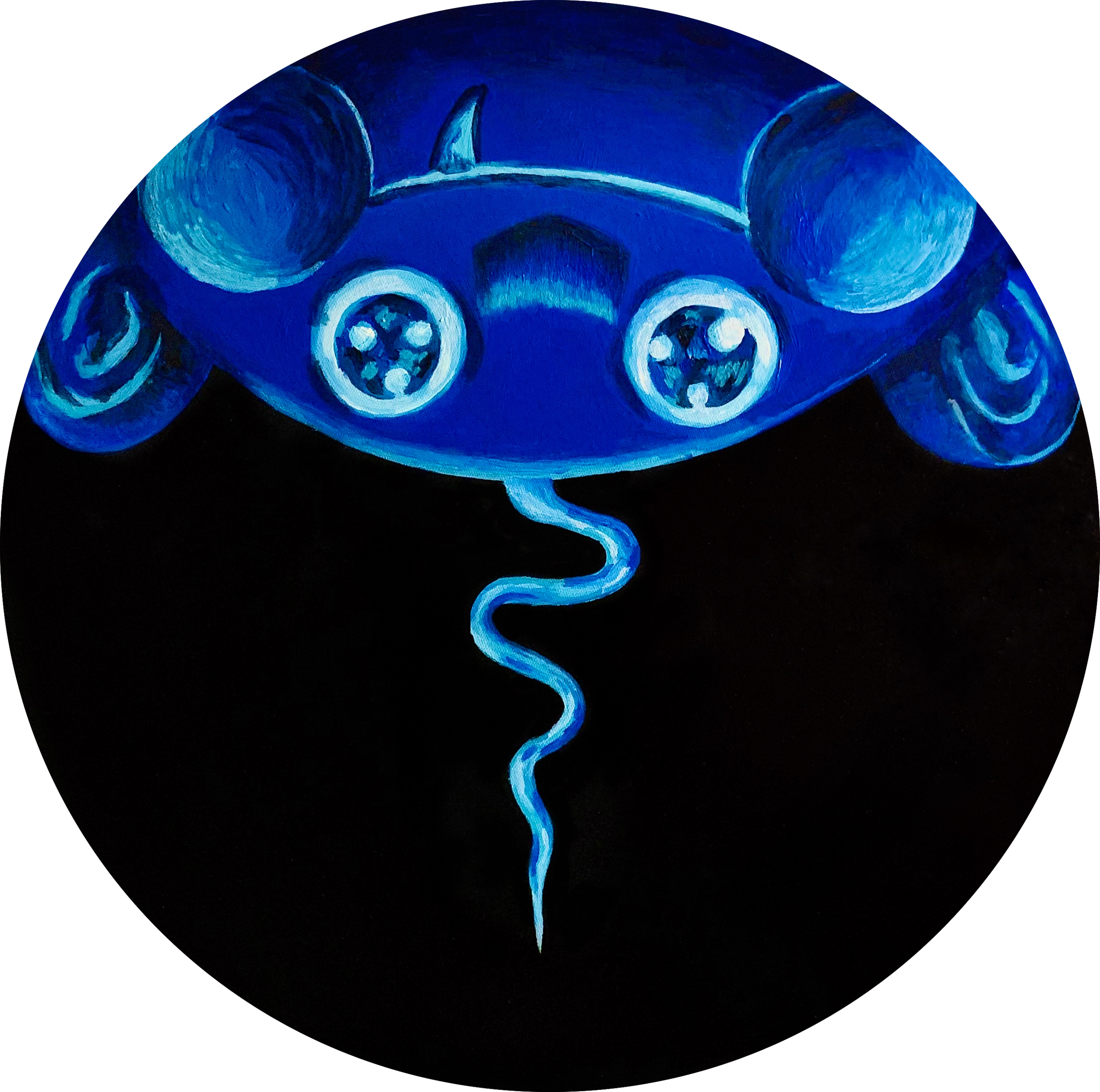
Love robot, it is a nano-sized robot born under the epidemic. Although it is invisible to the naked eye, it has a strong sense of presence and power. It is patched together again, producing complete love and returning it to the original owner, bringing a little bit of warmth to this smoky society.
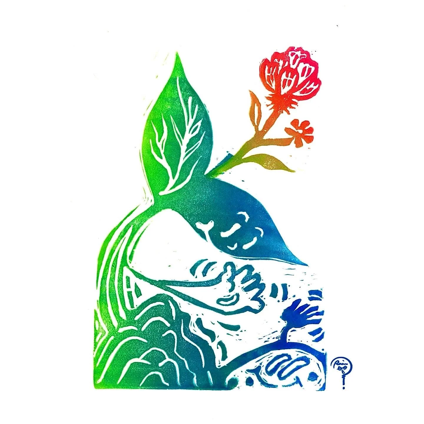
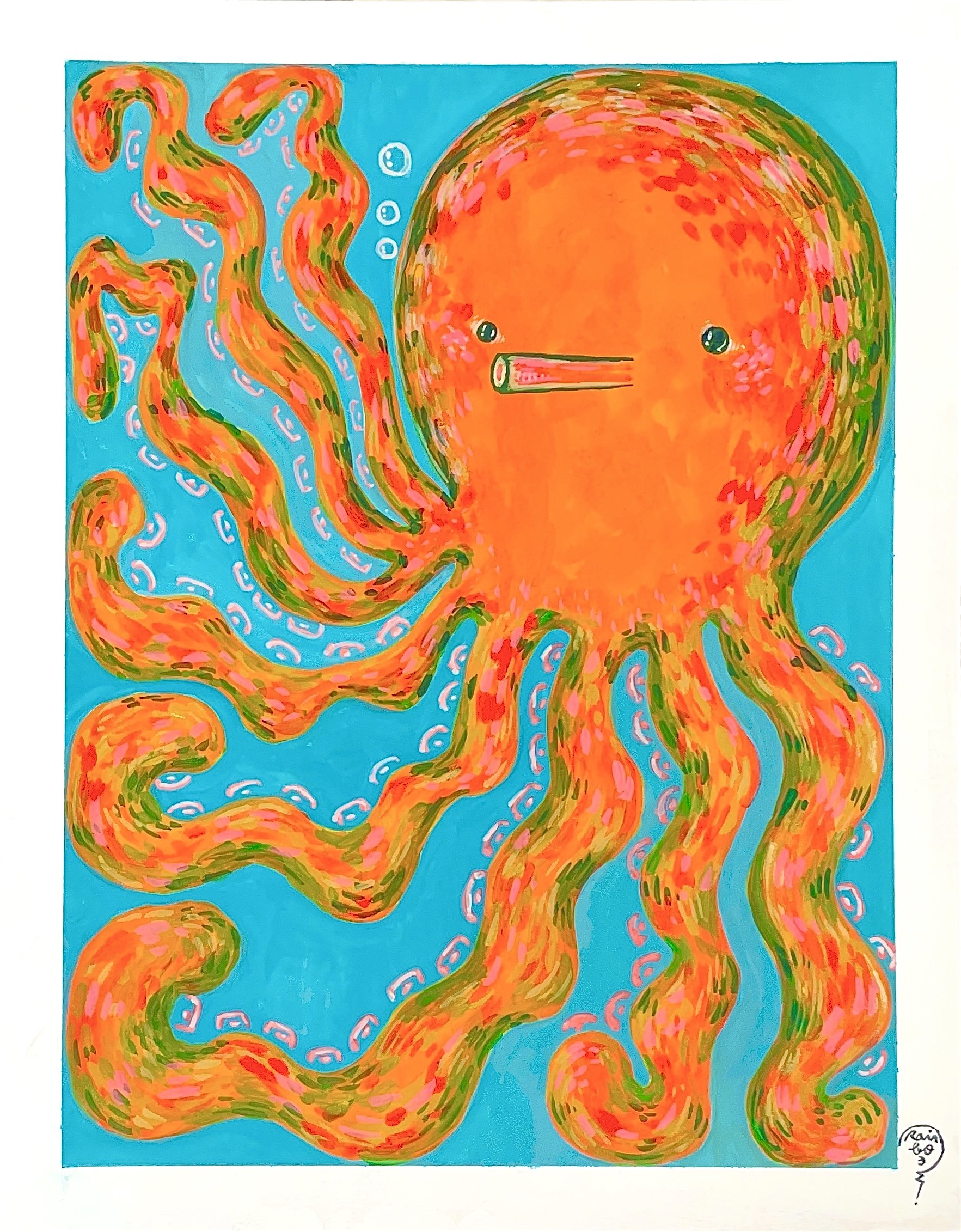
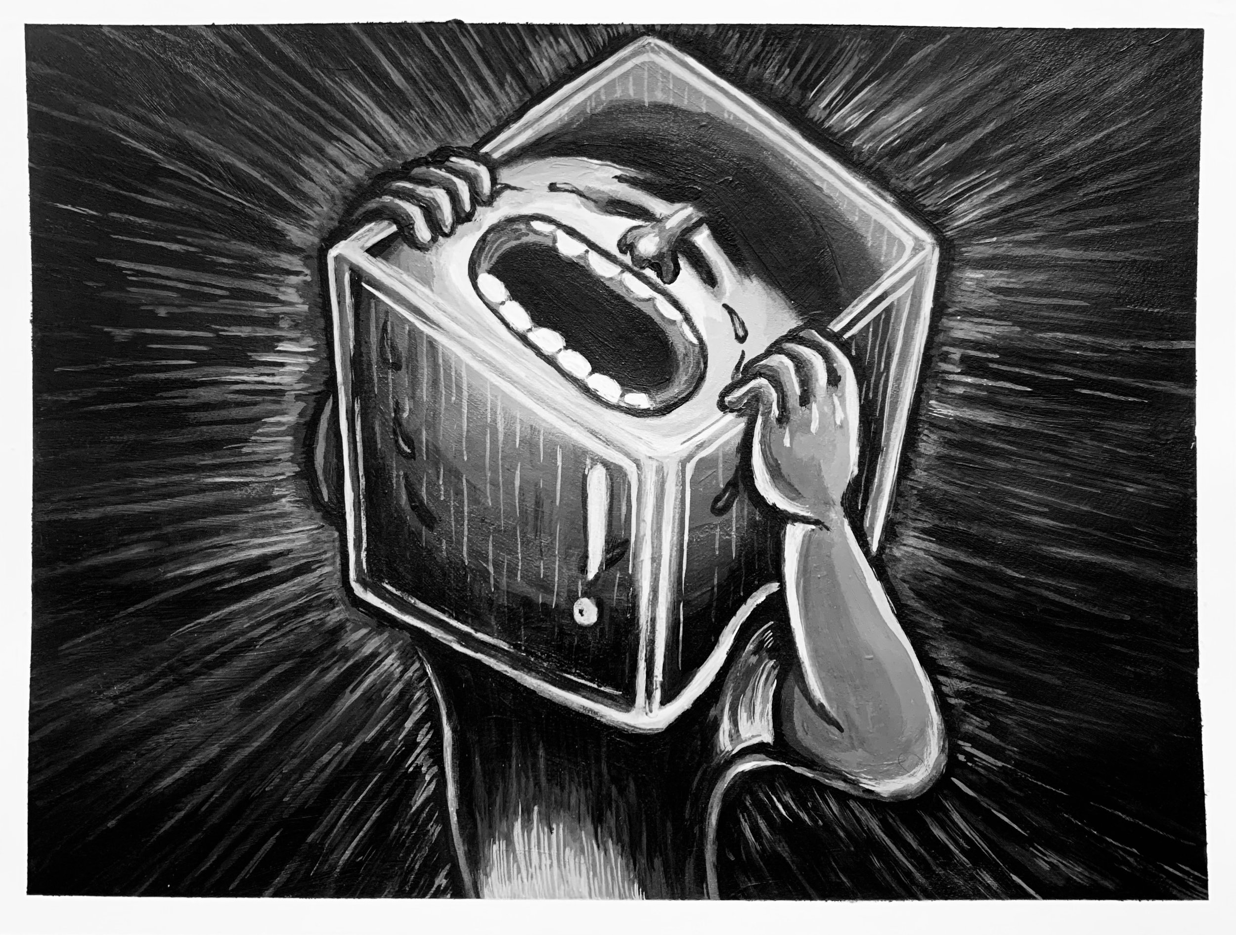
Let me out. Let me reach out.
When I was bullied, I wanted to ask for help but no matter what I did, no one could hear me. Just like in a secluded and confined asylum filled with water to the brim, all I could hear was my own heartbeat reverberating and pulsing in the water. In all of the world, I was the only one left.


"We’re born to be..."
This series is divided into four topics, "Speak Out", "Love & Peace", "Collab", and "Unique" is the core propositions, respectively. In this series of canvases, I chose the circle, because, in the Renaissance period, the circle was regarded as a symbol of perfection. In Christianity, the circle is a perfect shape, because there is no beginning and no end, and there is an eternal meaning. I want to use this idea to extend the attitude I express, which can be infinitely extended and continued. "We’re born to be" is to accept our original appearance and express it for ourselves, not to be influenced by the world, let alone be labeled.
In terms of character development, I prefer to be genderless and race-less, and even these human figures are more inclined to the original appearance of babies, trying to get closer to the axis of "Born".
The reason why the background is created in monochrome black is that I want to focus only on the relationship between the characters, therefore, the best presentation is to simplify the background, and monochrome is the most direct way. Guide the viewer to the correct visual direction and convey the correct information.
*When the work is exhibited in a dark space, it will show a different appearance by illuminating the work with a special light. The presence of fluorescent colors highlights the relationship between the characters in each work.
————————————————————————————————
In the three pictures, there are two protagonists with sharp contrast and different skin colors, embracing each other lovingly, extending to the left and right canvases, they hold a mirror to reflect themselves at the same time, and the reflected result is each other, which symbolizes "We are the same", even though we seem to be different races, we're still the same, we're all equal.
"We’re born to be..."
This series is divided into four topics, "Speak Out", "Love & Peace", "Collab", and "Unique" is the core propositions, respectively. In this series of canvases, I chose the circle, because, in the Renaissance period, the circle was regarded as a symbol of perfection. In Christianity, the circle is a perfect shape, because there is no beginning and no end, and there is an eternal meaning. I want to use this idea to extend the attitude I express, which can be infinitely extended and continued. "We’re born to be" is to accept our original appearance and express it for ourselves, not to be influenced by the world, let alone be labeled.
In terms of character development, I prefer to be genderless and race-less, and even these human figures are more inclined to the original appearance of babies, trying to get closer to the axis of "Born".
The reason why the background is created in monochrome black is that I want to focus only on the relationship between the characters, therefore, the best presentation is to simplify the background, and monochrome is the most direct way. Guide the viewer to the correct visual direction and convey the correct information.
*When the work is exhibited in a dark space, it will show a different appearance by illuminating the work with a special light. The presence of fluorescent colors highlights the relationship between the characters in each work.
————————————————————————————————-
I created and designed three different characters, and each of them has a different personality; from their standpoint, the way they appear on the screen, their looks, and their colors, each one is unique.
"We’re born to be..."
This series is divided into four topics, "Speak Out", "Love & Peace", "Collab", and "Unique" is the core propositions, respectively. In this series of canvases, I chose the circle, because, in the Renaissance period, the circle was regarded as a symbol of perfection. In Christianity, the circle is a perfect shape, because there is no beginning and no end, and there is an eternal meaning. I want to use this idea to extend the attitude I express, which can be infinitely extended and continued. "We’re born to be" is to accept our original appearance and express it for ourselves, not to be influenced by the world, let alone be labeled.
In terms of character development, I prefer to be genderless and race-less, and even these human figures are more inclined to the original appearance of babies, trying to get closer to the axis of "Born".
The reason why the background is created in monochrome black is that I want to focus only on the relationship between the characters, therefore, the best presentation is to simplify the background, and monochrome is the most direct way. Guide the viewer to the correct visual direction and convey the correct information.
*When the work is exhibited in a dark space, it will show a different appearance by illuminating the work with a special light. The presence of fluorescent colors highlights the relationship between the characters in each work.
————————————————————————————————
In recent years, the social atmosphere has changed, social platforms have become a part of life, self-awareness has risen, and the courage to speak out for oneself has become a universal value. But it also creates more anxiety and tension in society and is slowly swallowed up by negative energy. When I start to think of ”protesting“ or “speaking out“ can only be linked to negative emotions.
With this work, I want to return to the original intention of speaking, with the four main emotions Delight\ Anger\Sorrow\Happiness, with the original human form baby has not been polluted by the complicated world, to show "Speak Out" with the simplest emotions, Speak out is not only negative, what is interesting is that different emotional types affect the different aspects of "Speak out".
"We’re born to be..."
This series is divided into four topics, "Speak Out", "Love & Peace", "Collab", and "Unique" is the core propositions, respectively. In this series of canvases, I chose the circle, because, in the Renaissance period, the circle was regarded as a symbol of perfection. In Christianity, the circle is a perfect shape, because there is no beginning and no end, and there is an eternal meaning. I want to use this idea to extend the attitude I express, which can be infinitely extended and continued. "We’re born to be" is to accept our original appearance and express it for ourselves, not to be influenced by the world, let alone be labeled.
In terms of character development, I prefer to be genderless and race-less, and even these human figures are more inclined to the original appearance of babies, trying to get closer to the axis of "Born".
The reason why the background is created in monochrome black is that I want to focus only on the relationship between the characters, therefore, the best presentation is to simplify the background, and monochrome is the most direct way. Guide the viewer to the correct visual direction and convey the correct information.
*When the work is exhibited in a dark space, it will show a different appearance by illuminating the work with a special light. The presence of fluorescent colors highlights the relationship between the characters in each work.
————————————————————————————————-
I created and designed three different characters, and each of them has a different personality; from their standpoint, the way they appear on the screen, their looks, and their colors, each one is unique.
"We’re born to be..."
This series is divided into four topics, "Speak Out", "Love & Peace", "Collab", and "Unique" is the core propositions, respectively. In this series of canvases, I chose the circle, because, in the Renaissance period, the circle was regarded as a symbol of perfection. In Christianity, the circle is a perfect shape, because there is no beginning and no end, and there is an eternal meaning. I want to use this idea to extend the attitude I express, which can be infinitely extended and continued. "We’re born to be" is to accept our original appearance and express it for ourselves, not to be influenced by the world, let alone be labeled.
In terms of character development, I prefer to be genderless and race-less, and even these human figures are more inclined to the original appearance of babies, trying to get closer to the axis of "Born".
The reason why the background is created in monochrome black is that I want to focus only on the relationship between the characters, therefore, the best presentation is to simplify the background, and monochrome is the most direct way. Guide the viewer to the correct visual direction and convey the correct information.
*When the work is exhibited in a dark space, it will show a different appearance by illuminating the work with a special light. The presence of fluorescent colors highlights the relationship between the characters in each work.
————————————————————————————————-
In recent years, the social atmosphere has changed, social platforms have become a part of life, self-awareness has risen, and the courage to speak out for oneself has become a universal value. But it also creates more anxiety and tension in society and is slowly swallowed up by negative energy. When I start to think of ”protesting“ or “speaking out“ can only be linked to negative emotions.
With this work, I want to return to the original intention of speaking, with the four main emotions Delight\ Anger\Sorrow\Happiness, with the original human form baby has not been polluted by the complicated world, to show "Speak Out" with the simplest emotions, Speak out is not only negative, what is interesting is that different emotional types affect the different aspects of "Speak out".
"We’re born to be..."
This series is divided into four topics, "Speak Out", "Love & Peace", "Collab", and "Unique" is the core propositions, respectively. In this series of canvases, I chose the circle, because, in the Renaissance period, the circle was regarded as a symbol of perfection. In Christianity, the circle is a perfect shape, because there is no beginning and no end, and there is an eternal meaning. I want to use this idea to extend the attitude I express, which can be infinitely extended and continued. "We’re born to be" is to accept our original appearance and express it for ourselves, not to be influenced by the world, let alone be labeled.
In terms of character development, I prefer to be genderless and race-less, and even these human figures are more inclined to the original appearance of babies, trying to get closer to the axis of "Born".
The reason why the background is created in monochrome black is that I want to focus only on the relationship between the characters, therefore, the best presentation is to simplify the background, and monochrome is the most direct way. Guide the viewer to the correct visual direction and convey the correct information.
*When the work is exhibited in a dark space, it will show a different appearance by illuminating the work with a special light. The presence of fluorescent colors highlights the relationship between the characters in each work.
_______________________________________________________
This is an extension of "Love & Peace". It is a metaphor for childhood games: three people and four legs. There are no issues of skin color, race, identity, or gender. The atmosphere in the picture is innocent, peaceful, and loving. Everyone starts from the same starting point. Similarly, to complete this task, each of them lacks a lot of roles, each of which is very important, and it cannot be completed without any one of them. This is a vision that hopes that this complex society can be a little simpler.
"We’re born to be..."
This series is divided into four topics, "Speak Out", "Love & Peace", "Collab", and "Unique" is the core propositions, respectively. In this series of canvases, I chose the circle, because, in the Renaissance period, the circle was regarded as a symbol of perfection. In Christianity, the circle is a perfect shape, because there is no beginning and no end, and there is an eternal meaning. I want to use this idea to extend the attitude I express, which can be infinitely extended and continued. "We’re born to be" is to accept our original appearance and express it for ourselves, not to be influenced by the world, let alone be labeled.
In terms of character development, I prefer to be genderless and race-less, and even these human figures are more inclined to the original appearance of babies, trying to get closer to the axis of "Born".
The reason why the background is created in monochrome black is that I want to focus only on the relationship between the characters, therefore, the best presentation is to simplify the background, and monochrome is the most direct way. Guide the viewer to the correct visual direction and convey the correct information.
*When the work is exhibited in a dark space, it will show a different appearance by illuminating the work with a special light. The presence of fluorescent colors highlights the relationship between the characters in each work.
————————————————————————————————-
In recent years, the social atmosphere has changed, social platforms have become a part of life, self-awareness has risen, and the courage to speak out for oneself has become a universal value. But it also creates more anxiety and tension in society and is slowly swallowed up by negative energy. When I start to think of ”protesting“ or “speaking out“ can only be linked to negative emotions.
With this work, I want to return to the original intention of speaking, with the four main emotions Delight\ Anger\Sorrow\Happiness, with the original human form baby has not been polluted by the complicated world, to show "Speak Out" with the simplest emotions, Speak out is not only negative, what is interesting is that different emotional types affect the different aspects of "Speak out".
"We’re born to be..."
This series is divided into four topics, "Speak Out", "Love & Peace", "Collab", and "Unique" is the core propositions, respectively. In this series of canvases, I chose the circle, because, in the Renaissance period, the circle was regarded as a symbol of perfection. In Christianity, the circle is a perfect shape, because there is no beginning and no end, and there is an eternal meaning. I want to use this idea to extend the attitude I express, which can be infinitely extended and continued. "We’re born to be" is to accept our original appearance and express it for ourselves, not to be influenced by the world, let alone be labeled.
In terms of character development, I prefer to be genderless and race-less, and even these human figures are more inclined to the original appearance of babies, trying to get closer to the axis of "Born".
The reason why the background is created in monochrome black is that I want to focus only on the relationship between the characters, therefore, the best presentation is to simplify the background, and monochrome is the most direct way. Guide the viewer to the correct visual direction and convey the correct information.
*When the work is exhibited in a dark space, it will show a different appearance by illuminating the work with a special light. The presence of fluorescent colors highlights the relationship between the characters in each work.
————————————————————————————————-In recent years, the social atmosphere has changed, social platforms have become a part of life, self-awareness has risen, and the courage to speak out for oneself has become a universal value. But it also creates more anxiety and tension in society and is slowly swallowed up by negative energy. When I start to think of ”protesting“ or “speaking out“ can only be linked to negative emotions.
With this work, I want to return to the original intention of speaking, with the four main emotions Delight\ Anger\Sorrow\Happiness, with the original human form baby has not been polluted by the complicated world, to show "Speak Out" with the simplest emotions, Speak out is not only negative, what is interesting is that different emotional types affect the different aspects of "Speak out".
This is the first time I have used acrylic to paint portraits. The use of every color in each piece, from hair to skin color to facial features, represents my personal understanding of the model's appearance and aura. I enjoy the process.
This is the first time I have used acrylic to paint portraits. The use of every color in each piece, from hair to skin color to facial features, represents my personal understanding of the model's appearance and aura. I enjoy the process.
This is the first time I have used acrylic to paint portraits. The use of every color in each piece, from hair to skin color to facial features, represents my personal understanding of the model's appearance and aura. I enjoy the process.
These three works were created during the Covid-19 epidemic. The people and things around me include my own story. I deeply feel that "love" is a very important existence. Even in this severe living environment, love can overcome Everything, love can bring warmth to this cold society.
Love robot, it is a nano-sized robot born under the epidemic. Although it is invisible to the naked eye, it has a strong sense of presence and power. It is patched together again, producing complete love and returning it to the original owner, bringing a little bit of warmth to this smoky society.
Let me out. Let me reach out.
When I was bullied, I wanted to ask for help but no matter what I did, no one could hear me. Just like in a secluded and confined asylum filled with water to the brim, all I could hear was my own heartbeat reverberating and pulsing in the water. In all of the world, I was the only one left.
